To date, the vibrating animated icons have been commonly used on the Graphic User Interface (GUI). The development of information media technology has made it possible and easy to produce various expressions, including active motion elements. The possibility of various expressions has made ideas expanding boundlessly and the fine looking of contents dynamically. As what we have seen today, designers usually have used the active graphic to produce viewers' attention, or for the other purposes. The vibrating animated image is the most general kind among the active graphics. For instance, designers have used the vibrating icon to give a warning or message to users on the GUI.
Past research has almost focused on the static graphic development, which has never involved the moving effect on humans' perception and sensation. Therefore, it's essential to clarify the effective design for expressing various movements on dynamic graphics, and to understand how the motion perceptions were felt. In this paper, we name the vibrating animated icon in this way as “vibrating icon” and clarify features of the effective design by creating vibrating icon to express visual vibrations.
Previous research has shown that “intermodality” phenomenon is existing. The condition of intermodality is that the individual can percept the similar sensation in different sensory modalities subliminally. For example, the individual somewhat can "hear" (feel) the bright or dark sound without seeing a thing (Mark, 1982). This phenomenon shows that there are some innate qualities crossing different sensory modalities.
Generally the vibrating icon is consisted of several similar continuous pictures, which are divided by time-slices. The visual vibration-like effects can be produced by display each picture in order repeatedly in a simple harmonic motion.
Basically, vibratory perception is a characteristic modality of tactile sensation, but the individual also can “see” the vibration via their eyes. The individual can experience the visual vibratory perception when he or she is watching the vibrating icon without receiving (touching) the real tactile vibration stimulus. That is, there also is an intermodality phenomenon between the visual vibratory perception and the vibrotactile.
Researchers of experimental psychophysics, Steven (1959) and Steven & Marks (1959) have noted that the “Cross-Modali Magnitude Matching” is practicable by experiments. In addition, R. Huang (1998) has improved the “Cross-Modali matching” as a useful measurement technique to measure the sensory magnitude.
Although the gap between two different modalities is existing, there is somehow an unification among different perception magnitudes in the intermodality phenomenon. Thus, we may be able to estimate the perception magnitude by cross-modality matching to obtain the interval scaled data. Specifically, we may be able to deduce the visual vibratory perception by estimating the magnitude of vibrotactile.
Based on the intermodality phenomenon between vibrotactile and visual vibratory perception, in this experiment the author has used the “Cross-Modali Matching Measurement” technique to measure the magnitude of visual vibratory perception.
Based on the Conjoint Analysis, 7 divided attributes (vibration frequency, vibration amplitude, direction, appearance, size, edge distinction, and contras) of the vibrating icon were picked up. It was hypothesized that these attributes might influence the visual vibratory perception.
At first decided 3 “levels” of 7 attributes what should be per attributes as follows:
1. Vibration Frequency: There are 3 levels of time-slice for each divided picture to display repeatedly as per 1/100, 10/100, and 20/100 second.
2. Vibration Amplitude: There are 3 levels of vibration amplitude between every two continuous pictures as 1, 5, and 9 pixel offset distance. (Total displacement are 2,10,and18 pixel)
3. Vibration Direction: There are 3 levels of motion direction as horizontal motion, vertical motion, and expanding motion.
4. Appearance: There are 3 basic shape of icon’s appearance as circular (a round shape), square, and triangular form.
5. Size: There are 3 levels of icon’s size as 10?0, 25?5, 40?0 pixel.
6. Edge Distinction: There are 3 levels distinction of icon’s edge from clear to indistinct, as 0, 3, and 5 pixel made by the indistinct effect function of Microsoft Image Composer.
7. Contrast: There are 3 levels of gray color to contrast with the white background as (0,0,0), (100,100,100), and (200,200,200) on P.G.B. color mode.
There are 37=2187 possibilities (we called it as “concept” in Conjoint Analysis) to compose these attributes. Therefore, the author used the “fractional factorial design” method to cut down the quantity of concepts. Thus, we built an orthogonal array (N,k,s,t)=(18,7,3,2) by the “symmetric orthogonal arrays” method, and followed this orthogonal array to develop concepts (Table 1). The author developed 18 concepts (vibrating icon) as visual-vibrating stimuli for the examination in this experiment. Each vibrating icon was configured on computer abided by this stimulus set construction. The author used the package application software of “Microsoft Image Composer” to developed these 18 vibrating icons, and saved them in HTML document.

A computer driven controllable vibrotactile-simulator was used in this experiment for matching with the visual vibratory perception. This vibrotactile-simulator system is composed by a vibration device, a function generator, a set top box, and controlled by the NEC PC-98 personal computer. The frequency of vibrotactile is adjustable from 0.01 to 10K Hz but not the amplitude of vibration.
Figure 1: Situation of experiment
Each experiment was held to stay in the same environment as possible for reducing inaccuracy. We used the same monitor and the same setting (75m Hz) to avoid different lighting situations, control the noise condition of testing environment in the same situation, and record the temperature of each time. Taking a break off time per experiment to avoid the sensory inhibition phenomenon. To avoid interference with the effect of noise from vibrotactile simulator, all subjects were requested to wear a headphone with hearing “white sound”.
18 vibrating icons as concepts were presented orderly on the screen of the computer’s monitor.
All subjects were requested to watching the vibrating icon concepts (as the visual vibration stimulus), feel the visual vibration, and answer his/her perception by adjustment the vibration. All subjects were asked to adjust the frequency of vibration on vibrotactile-simulator to matching with the visual vibration “feeling” when they watching the vibrating icon concepts.
It measures the magnitude of visual-vibratory perception with vibrotactile perception by the Cross-Modali Matching measurement technique.
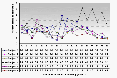
The adjustment of the vibration frequency on vibrotactile-simulator was recorded for each test.6 subjects, 18 stimuli of vibrating icon concepts were asked. Thus, 108 results of response were obtained (Table 2). For estimating the viewers’ preference value systems, we transformed the original ratio scale based data to an ordinal scale based data, which was summarized in Table 3.
 Table
2: results of experiment


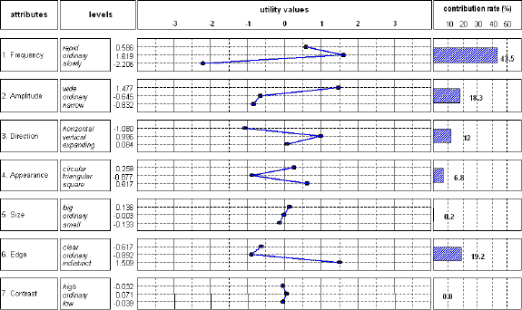
This result identified the relative importance attribute of visual-vibration perception on vibrating icons. We found that the attributes of vibrating icon influenced the visual vibration in a proper order as follows, “vibration frequency” > ”edge distinction” > “vibration amplitude” > “vibration direction” > “appearance” > “size” > “contras.”
These utilities also tell us the extent to which each of these attributes (features) drives the perception to express the visual vibration. Utility can be defined as a number, which represents the value that viewers place on an attribute. A low utility indicates less value, and a high utility indicates more value. In other words, it represents the relative "worth" of the features of vibrating icons.
Based on these utilities, we have made the following discussions:
It is very reasonable that the vibration frequency influences the visual vibratory perception potently. Noticeable point is that we found the visual-vibration perception become weakly when high vibration frequency over 100 times per second. It’s consistent with other research on “critical duration” in psychophysics (Bloch, 1885; Blondel, 1911; Long, 1951). Extending this, we suspect that the frequency might be kept in a specific range for expressing the visual vibration.
The edge distinction of vibrating icon is the second relative importance feature to express the visual vibration. We found that the more indistinct edge the more visual vibratory perception. The indistinct edge implies that it is active and dynamic. Actually, the designers and artists have used this skill on static graphics to express dynamic motion unconsciously for a long history.
Furthermore, the vibration amplitude of the vibrating icon also influences the visual vibration strongly. Nevertheless, the value of utilities is approximate in both narrow and ordinary levels of amplitude. It appears that it is effective in wide amplitude to express visual vibration relatively.
Compared with the hypothesis presented earlier, we found the contrast and the size seems to have no relationship with the visual-vibration perception. The author wonders it maybe due to the frequency, which was set in this experiment, is too low to bring about the effectiveness
We found that in the attribute of vibration direction, the vertical direction has a higher utility value than horizontal direction and expanding motion. Compared with horizontal movement, the vertical direction has a good fit to express the visual vibratory perception.
One possibility is that our human eyes are set by horizontal position. Our eyes are easier to follow the trail of visual movement in a horizontal direction than in a vertical direction. So the visual stimulus is relative weak in a horizontal direction. Thus, it is difficult to percept the visual vibration in a horizontal direction movement.
In static graphic, in general, the circular or square form is more stable than the triangular form. But it seems different in the situation of vibration. We suspect the reason of this difference as follows:
The three angles of the triangular form, one direct to the vertical direction, and two direct to the horizontal direction. At least there is one angle matched with movement direction. However, the circular form has no angle, and the angles of the square form do not direct vertical or horizontal directions.
This experiment identified the design factors of vibrating icon by exploring the potential feature combinations that are not currently available. It helps designers understand how individuals value features of vibrating icon by determining their judgements between different "levels" of those attributes. We summarized the conclusion about the features of visual vibratory perception on the vibrating icon as follows:
1. Features of visual-vibration perception are principally composed by attributes such as frequency, edge distinction, amplitude, vibration direction, and appearance. However, the size and contras are relatively unimportant on the vibrating icon.
2. The viewer will drive his/her perception based mainly on the frequency, and then on the edge distinction and vibration amplitude.
3.The vertical vibration direction is recommended for increasing the effect of the visual vibration.
4.The circular and square forms affect visual vibration more than the triangular form.
Designers can determine what features of a new vibrating icon should have and how it should be. In sum, designers can use this guideline to create the vibrating icon, and predict the effect of the visual vibration easily.
References
Rudolf Arnheim: Art and visual perception: a psychology of the creative eye, 1974, Revised Edition, (Trs. by C. S. Lee), Lion press Co., Taipei,1985
T. Oyama, S. Imai, etc: New Sensation & Perception Psychology Handbook, Sei-Shin Press, Japan Tokyo, 1994
Y. Wata, T. Oyama, etc: Sensation + Perception Psychology Handbook, Sei-Shin Press, Tokyo, 1974
Robin Huang, Harada Akira & Shimizu Yutaka: Visual Measurement Technology for Tactile “Kansei” Information, 3rd Asia Design Conference (China-Japan-Korea design Symposium ), Taiwan Taipei, p.613-620, 1998
C. I. Huang : Multivariate Analysis: An Introduction, China Economic Press, Taipei, 1995
Y. Shimizu: Design Aided System of Tactile Information Communication Machine for Blind, 1997